LAUNCHER
2015-2017
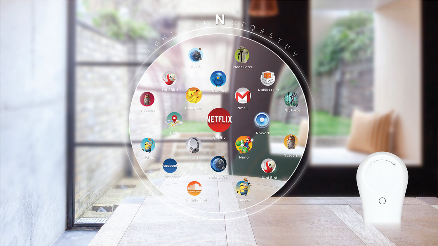
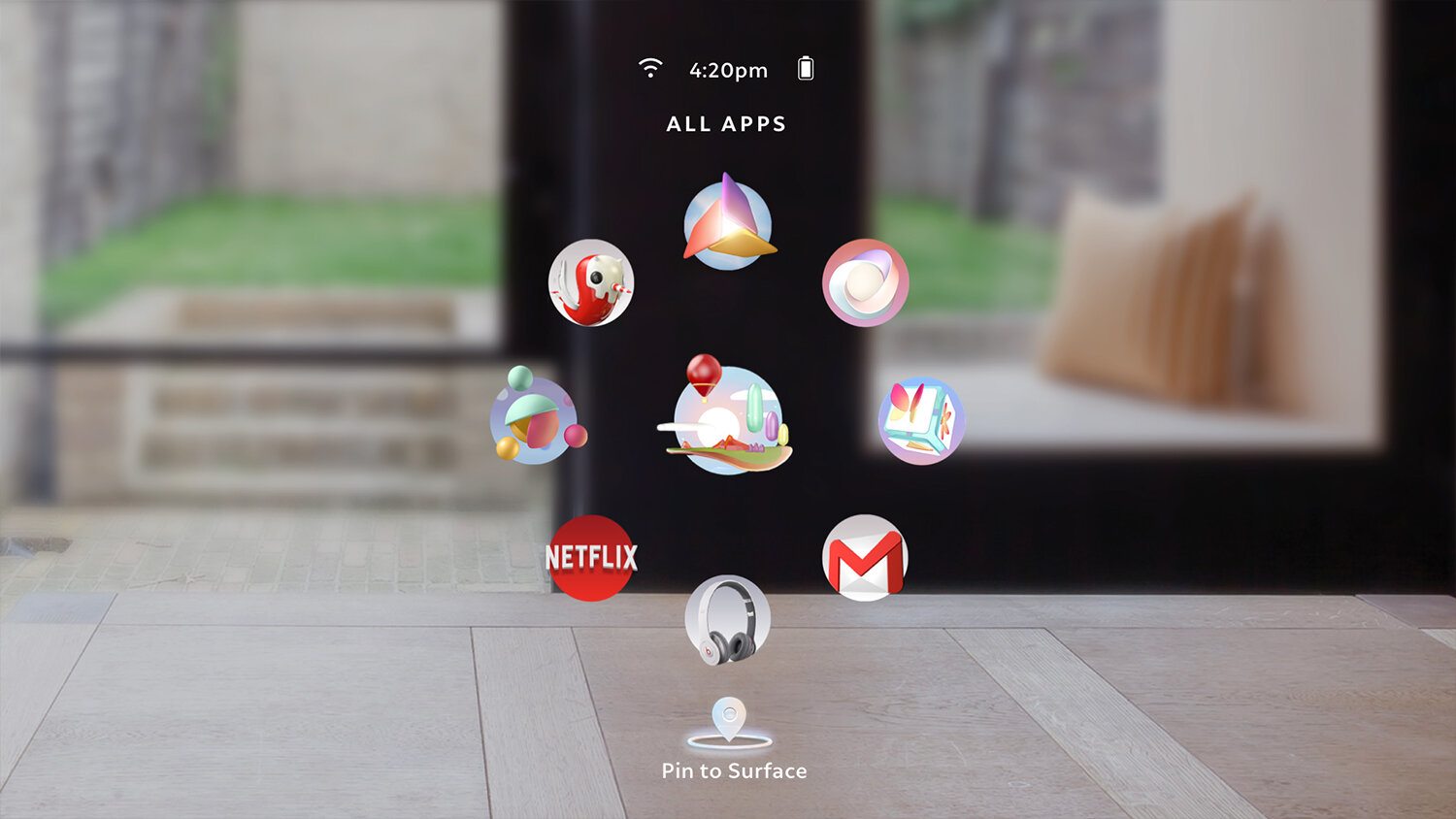
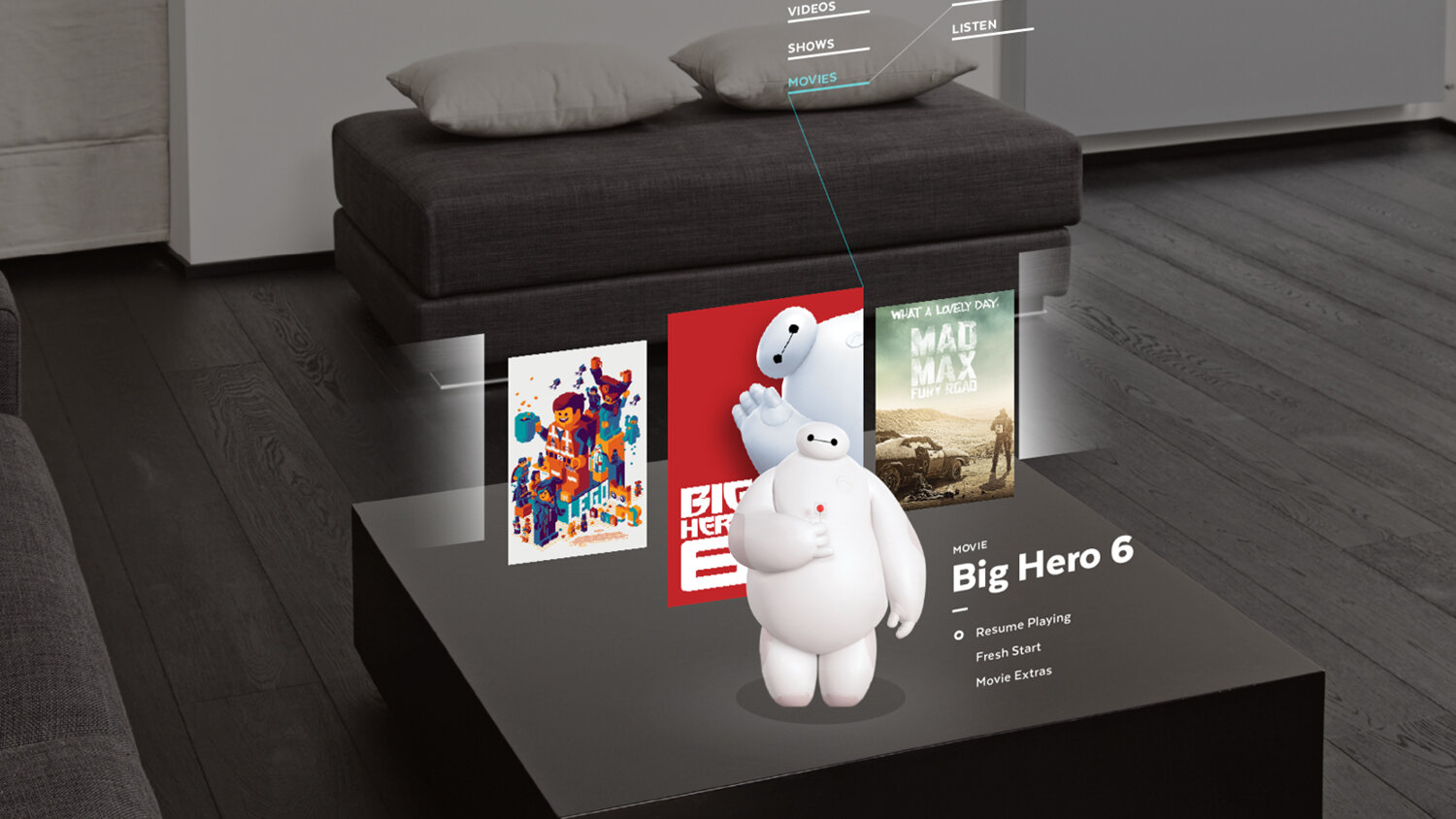
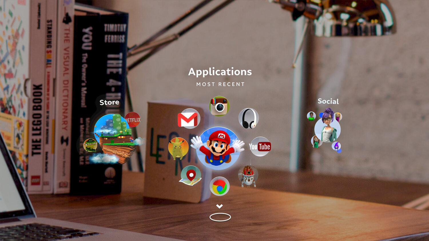
THE LAUNCHER IS OUR MIXED REALITY HOME.
WE CAN DIVE INTO NEW WORLDS OR PULL CONTENT INTO OUR OWN. IT’S INSTANTLY USABLE AND ALWAYS ACCESSIBLE. IT CONTAINS THE MOST ESSENTIAL FUNCTIONS JUST A TAP AWAY.

Mixed Reality thrives when it is responsive and minimal with its interfaces. When a system can be contextual and predictive about its environment, interactions feel effortless. The Launcher is the first step and acts as a centerpiece for the ML1.
THE TECH
All interfaces begin with the inputs of their hardware. To design the ideal home screen for the ML1, we tested the limits of our devices’ display, controls, eye-tracking, hand-tracking, environmental stability and spatial recognition.


DESIGN ITERATION
Our design principles focus on Ease-of-use, Efficiency, Comfort and Authenticity. With these as metrics, we built many transformative interaction paradigms. These can react to environments, extend objects, enable input methods and generate new ways of discovering content.

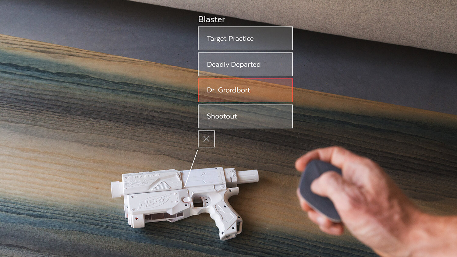
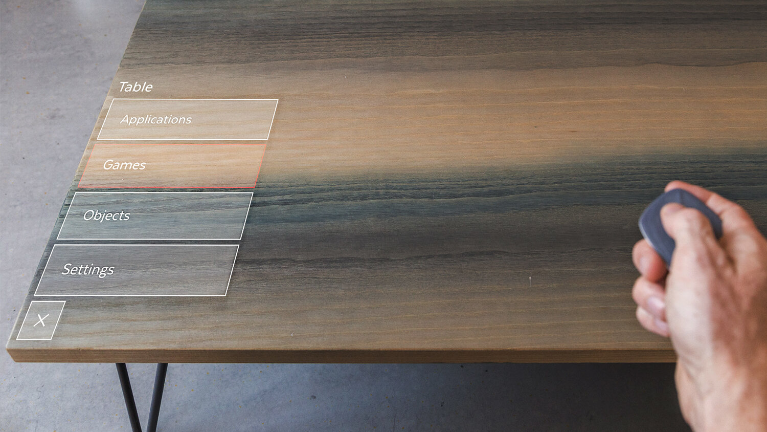
GESTURAL INTERFACE

PROSTHETIC

TANGIBLE

PHYSICAL CONTAINER

OBJECT ALIGNED

HOLODECK

WEARABLE

MATRIX

CONTEXTUAL

CONTROL GESTURE

AI ASSISTANT

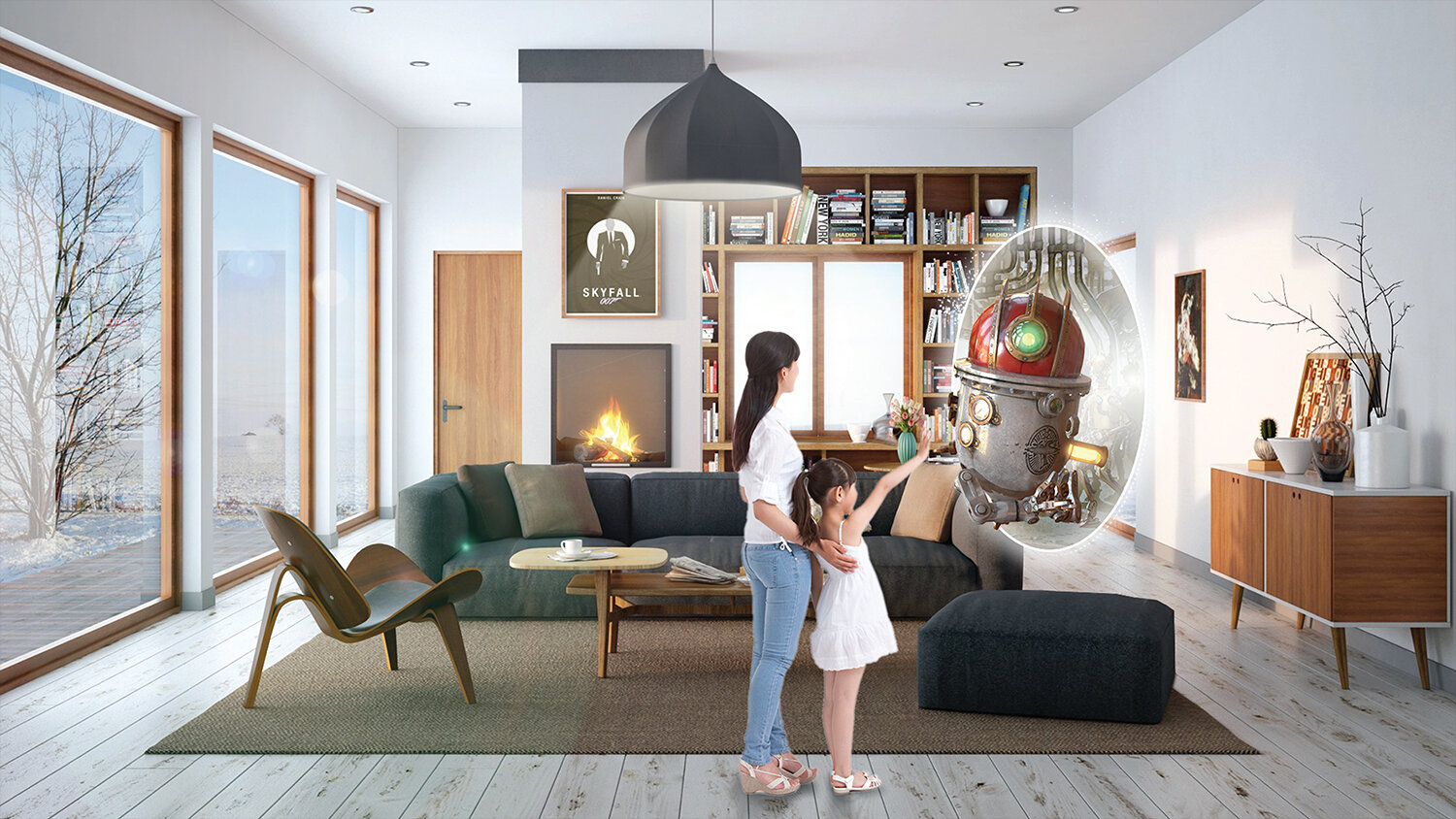
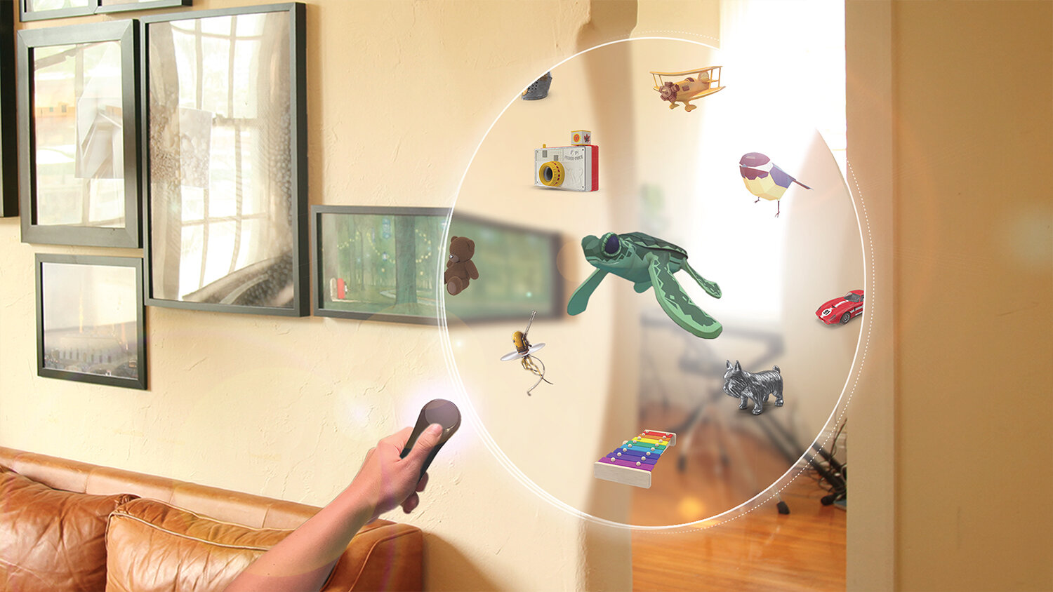
PORTAL
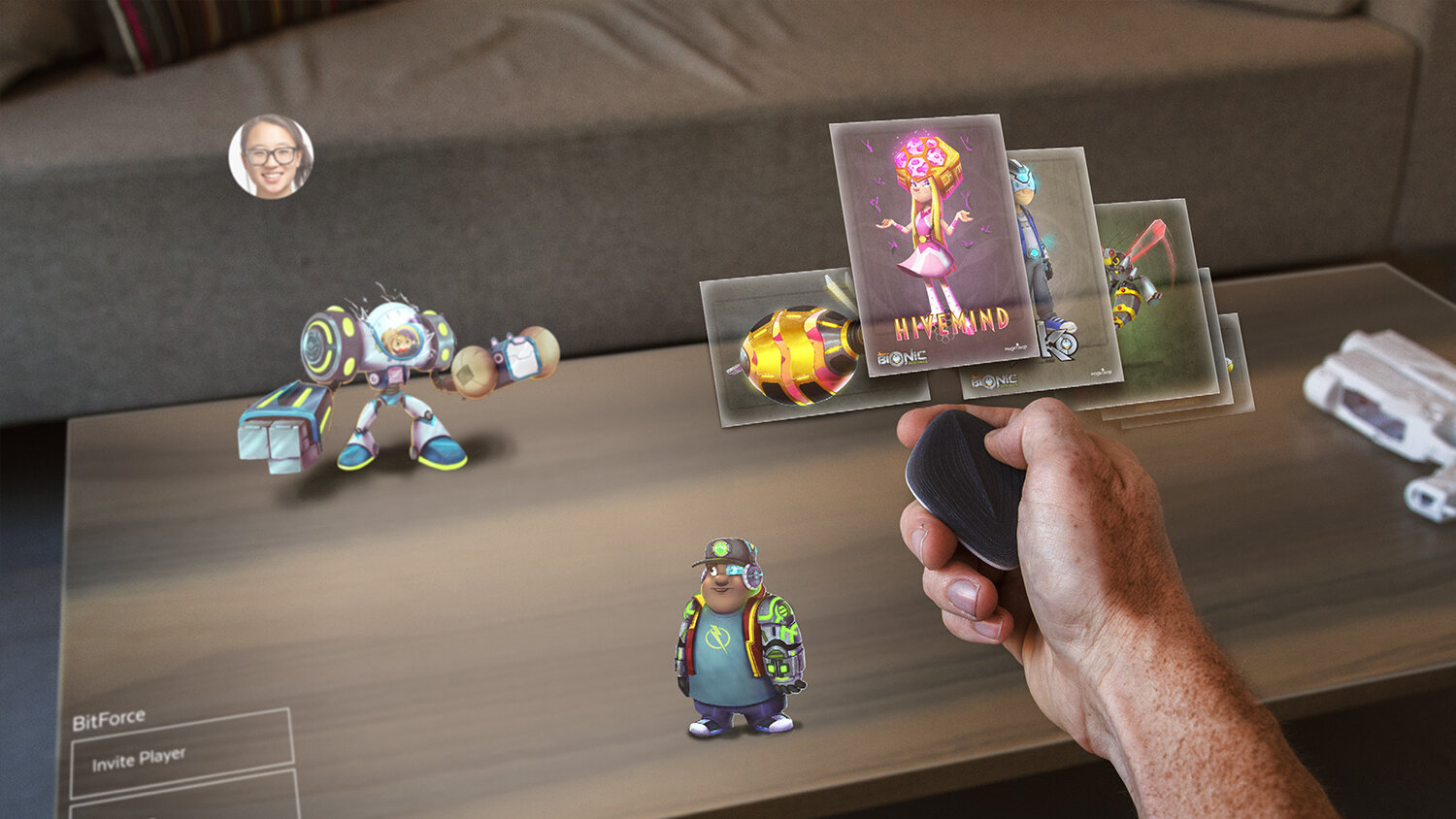
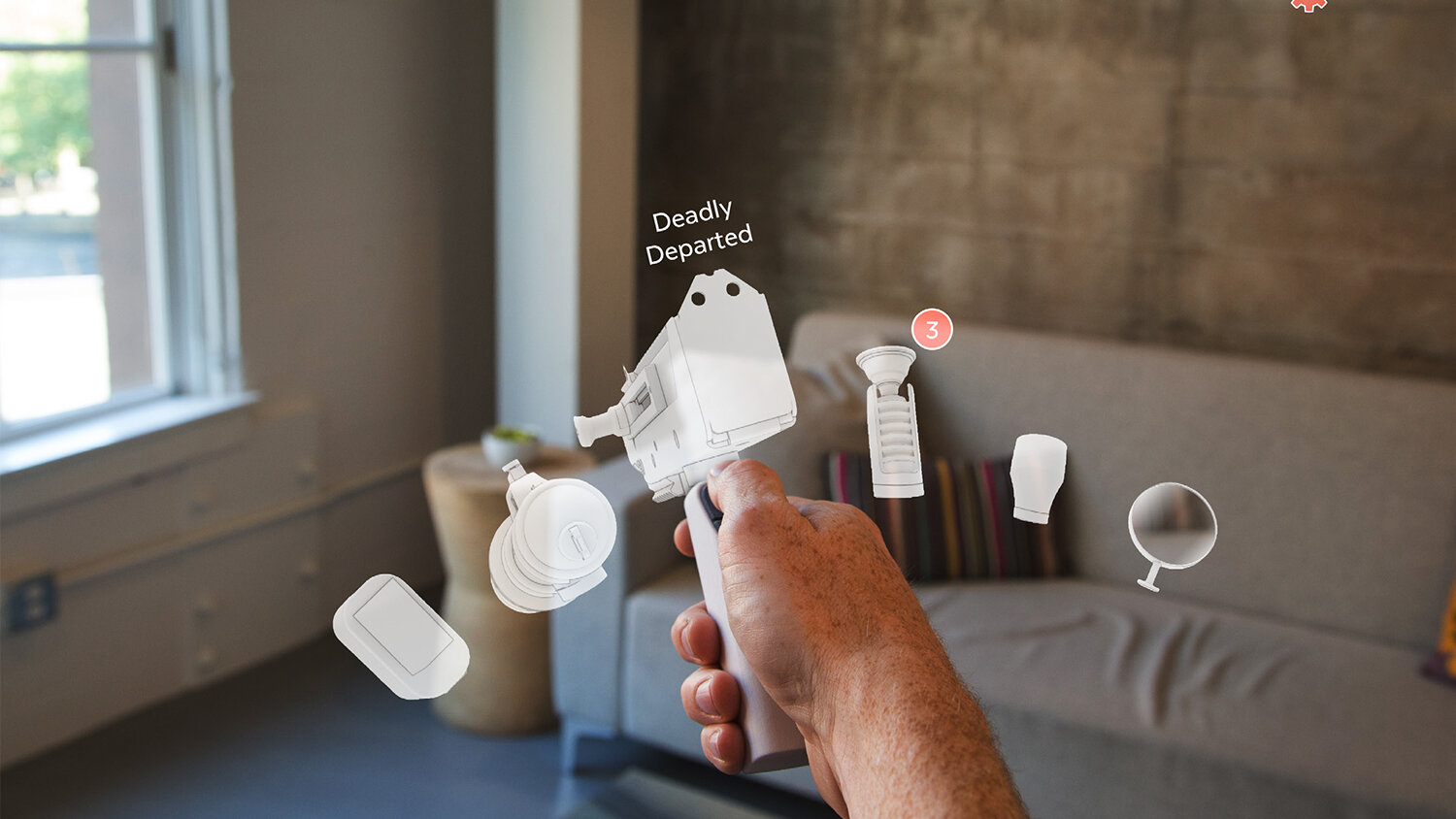
PROTOTYPING
By prototyping the best versions of our designs, we are able to test assumptions and experience first-hand which interactions are intuitive and delightful. Through this process we create patterns related to UI responsiveness, control schemes and environment reactivity.


USER TESTING
Formative user research is done throughout the iteration and prototyping cycles and feeds back into our designs to inform the outcomes. For the Launcher, we performed more comprehensive usability studies to ensure continued performance and validate our final outcomes.
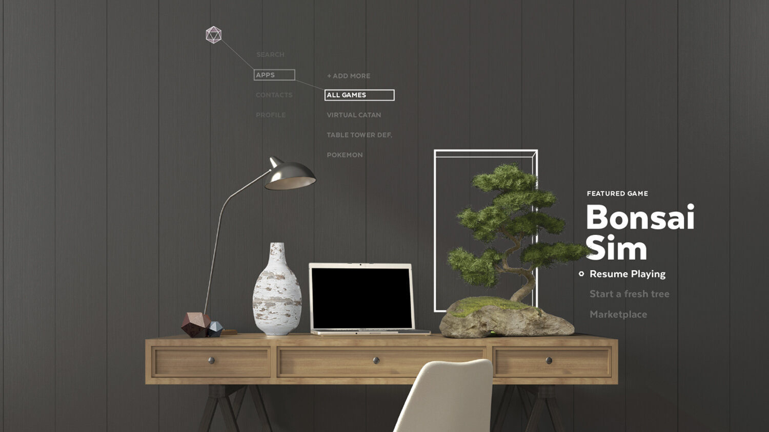
BRAND UNITY
The portal typology became an important part of our brand and created unity between our icons, user interface and industrial design motifs. Many of the patterns in our animations and layouts relate to the LEDs found in our hardware.

As the Magic Leap hardware, systems and input evolves, the Launcher will expand its potentials through new forms of discovery, spatial recognition and tangible interactions.
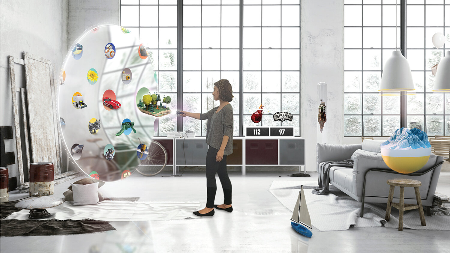
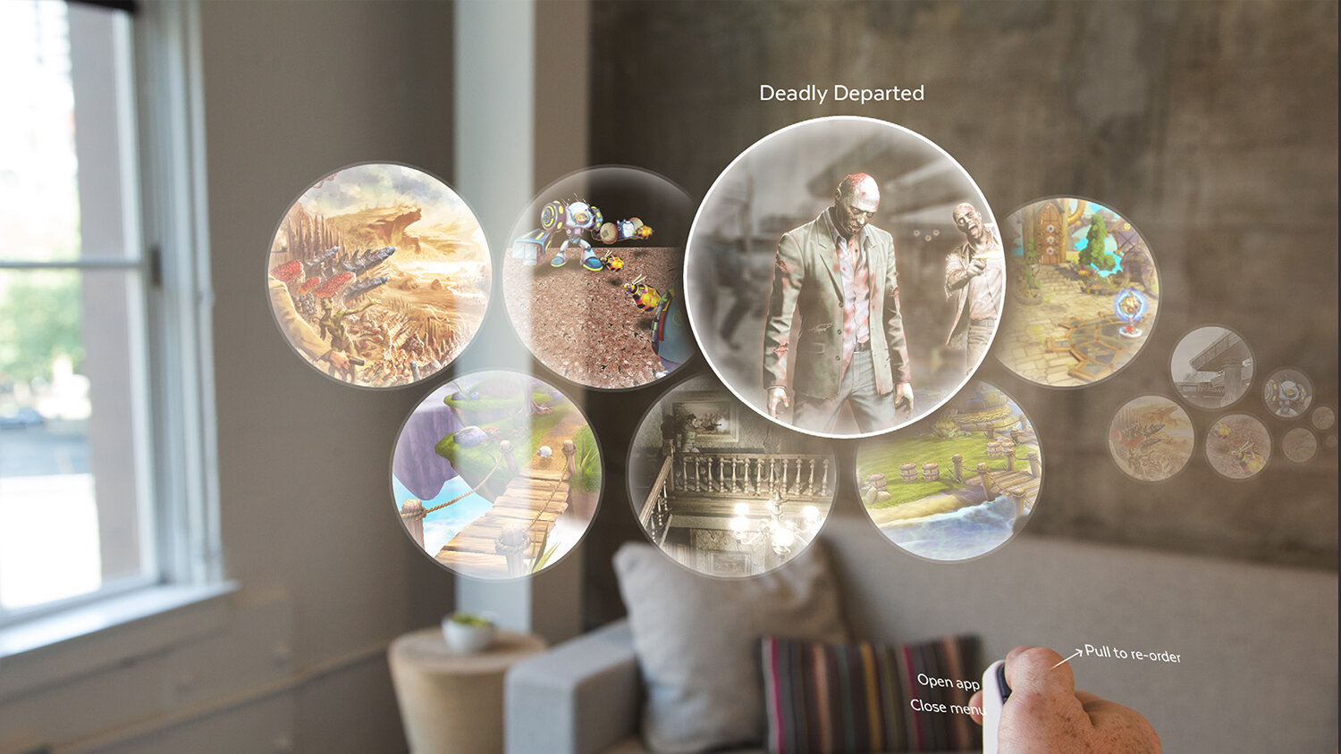
PORTAL ICONS
INTO OTHER WORLDS
PORTAL TYPOLOGY

CORE APP ITERATION


ANIMATION & IDENTITY
Our 3d portal icons create a signature identity for all applications to expand upon. These icons have the depth and flexibility to showcase the unique world that each application has to offer. The icons animate for hover, loading, launch and their app menu.
For our Core App icons, we wanted to create a sense of beauty, but also a deeper meaning in each one. The Social Icon on the right evokes connection through its nested forms, but as it animates, it reveals the connection between the users themselves.


